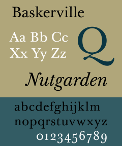
John Baskerville was a man of many talents including papier-mache, japanning, printing and type design. He lived in England from 1706-1775, and among his many talents made a unique typeface called Baskerville. This typestyle was unique to him and his interests. Baskerville, later in his life, owned a printing press and became successful in the United States when Benjamin Franklin introduced his work. After obtaining success, Baskerville had begun to influence many prominent people besides Benjamin Franklin, another printer, and Bodoni and Didot, European typographers who are considered the transitioned, modern typographers after Baskerville. John Baskerville is most known for his typography style, but the time spent at Cambridge University in his later life is what cemented Mr. Baskerville. His new use of fine inks and papers coupled with a "new" classical style helped draw attention to his inspiring work.
Baskerville as a typeface is one that draws from more classical type. The difference between classical type and John Baskerville's new type was a few subtle points. Baskerville is a serif designed to improve readibility. It has almost horizontal lowercase letters and employs more a circular design. It is a type designed to show elegance and simplicity. One of the main attributes of the typeface is its strong contr
Images.....

http://www.rightreading.com/typehead/baskerville.htm
http://images.google.com/images?hl=en&q=Baskerville+typeface&btnG=Search+Images&gbv=2
http://en.wikipedia.org/wiki/Baskerville
http://www.infoplease.com/ce6/people/A0806405.html

http://ilovetypography.com/2007/09/23/baskerville-john/

http://www.factmonster.com/ce6/people/A0806405.html
No comments:
Post a Comment