Monday, September 22, 2008

1960's Pop Art Movement Coupled with Design (psychedelia)

Beginning in the late 1950's and spanning the years of the 60's, typography and design in the United States and abroad took an auspicious turn of originality. With the new set on popular culture movement affecting art and design around the world, typography began to transcend from legibility and known methods of designs. Many texts were created solely for an aesthetic purpose. The International Style did stay true to many strong held conventions that kept type abroad legible enough for body text use, but the standards for text began to get skewed.
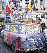
Known as the popular culture age, the 60's embraced new mindsets and accepted new ways of doing things. From the hippies and flower power to the invention of new typefaces for design and computers, this era was a progressive change from the past heading into the new modern ages of the computer's dominance in the 80's and today. The 60's seemed to produce a wide range of new typefaces including typefaces based on computer grids like OCR-A to Eurostile, a text distorting a circular form into an original "tv set" design. Many of the typefaces designed in the 60's were solely created for a simple solution to a problem. Letraset, a type that could be rubbed off a sheet onto artwork or clothing, became popular for its ability to make the common person a designer. The need for applicable type to interact with images in art made letraset an issue that was solved in the popular culture age. Many American texts were invented to follow the hippie movement springing up around the country. Psychedelia, type designed to mimic illegibility and intense colors of drugs, became the staple of flower power and antigovernmental ideals. While many random typefaces sprang up, European typographers were sticking to legibility rules. Often legible fonts would be paired with pop culture fonts. Legible types would make up large sections of text while more illegible yet interestingly different types were used for titles and small text concentrations.
To conclude, the 1960's proved to be a new step in the modern era of typography. Artists and typographers used their personal skills to influence and perpetuate cultural movements. Texts were designed to appease the general "pop" ideals. Many applications of texts were finally designed to aid in specific areas of desperate innovation such as the computers of this time and legibility issues.

Question... Name the two main categories typefaces described in 1960's article above fall into and name and least two of the types created in the 1960's.

www.wikipedia.com (various searches)


Monday, September 15, 2008

Typographic Terms

Absolute measurements: measurements that are a definite number. Used to express exact points in typography that are fixed.

Relative measurements: measurements that are not quite exact and are not constant finite expressions. These measurements are usually linked to something and therefore increase at a different rates. This type of measurement is defined by a relationship not something absolute.

Points: measurement related to a type's size. This measurement is for the character block size and not the actual character.

Pica: used to measure lines of text, this measurement is six to an inch.

X-height: used as a designing guide, x-height is the height of a lower letter x.

Em: a unit of measure dependent on the typesize. Used to help build a text and determine spacing.

En: one half the size of an em. Used also as a size measurement for the symbol for "to" and for nested clauses.

Dashes...

Hyphens: 1/3 the size of an em, this dash is used to combine two words, break up syllables into specific blocks of text, and makes words easier to understand by separating them.

En Dash: 1/2 the size of an em, this dash is used to pages, dates, and to substitute "to" in phrases involving travel.

Em Dash: standard dash, em dashes come in two forms. Standard em dashes are used to make lines since they are long enough to connect with other characters, and punctuating em dashes are used to house nested clauses because they leave room to not touch surrounding characters.

Alignment: the positioning of text in a text block, in a vertical and horizontal fashion.

Justification: aligning text equally on all sides in relation to area left in the top, bottom, left, and right. Sometimes employing excessive use of the hyphen to keep text equal.

Flush Left: aligning words along the left margin of the page for easier reading and to follow handwriting patterns.

Flush Right: harder to read and function correctly, this alignment is used to line up on the right margin and lay ragged on the left. Drastically different to body copy and sometimes used with picture captions.

Letterspacing: Addition of space between characters so no collisions occur.

Kerning: Subtraction of space between characters to allow words to form from letters.

Tracking: adjusting the spacing between characters in words.

Word Spacing: spacing between words not between characters.

Widow: lone word at end of paragraph.

Orphan: last one or two lines of a paragraph cut off from main paragraph to start a new column.

Leading: space between lines of text in a text body. With too much a text is drawn out and looks awkward, while too little leading caused overlap and inability to read easily.

Indents: space put in between a text line and the margin. Used to organize text and determined by a grid or point size.

First Line Indent: usually not a real first line indent, this phrase refers to the space between the first line of new text from the margin. It is possible to do the very first paragraph, but often this is awkward to look at.

Hanging Indent: this type of indent refers to the opposite of a first line indent. Every line of text is indented except for the first line.

Monday, September 8, 2008


Adrian Frutiger


Among other things, Adrian Frutiger was a Swiss born typist torn away from his love of sculpture at an early age to become one of the most influential typographers still alive today. The use of sculpture in his type occupation has most definitely made his typefaces interesting and useful in interpretation today.
Frutiger was born in Switzerland near Interlaken. Early in his design career he was chosen to be an apprentice. At age sixteen he studied in Zurich and once done with that moved to France to study under Charles Peignot who was amazed with Frutiger's work on an illustrated essay on text in Europe.
Though Adrian Frutiger created many typefaces and still works to find more he is most famous for his neo-grotesque typeface called Univers. Univers is one of three sans-serif typefaces that is designed in the Swiss design style. It is easy to read even far away and is designed using numbers instead of names. The main reason this typeface is so unique is due to the numbering system. Basically the weight of a letter is increased heading toward the number ten, yet the width and position become increasingly condensed as they travel the number ten. Adrian Frutiger also used a grid system to design his texts. The grid is basically a set of different fonts focusing around Frutiger's original Univers typeface. The other typefaces vary in weight, width, and other attributes. To summarize, Adrian Frutiger was and is an influential typeface designer driven by his love of sculpture.

http://en.wikipedia.org/w/index.php?title=Special%3ASearch&search=+frutiger+univers+grid&ns0=1&fulltext=Search
http://en.wikipedia.org/wiki/Univers
http://typophile.com/node/12118
http://www.identifont.com/show?110
http://www.myfonts.com/fonts/linotype/univers/familytree.html


Specimens of typefaces by Adrian Frutiger.


John Baskerville was a man of many talents including papier-mache, japanning, printing and type design. He lived in England from 1706-1775, and among his many talents made a unique typeface called Baskerville. This typestyle was unique to him and his interests. Baskerville, later in his life, owned a printing press and became successful in the United States when Benjamin Franklin introduced his work. After obtaining success, Baskerville had begun to influence many prominent people besides Benjamin Franklin, another printer, and Bodoni and Didot, European typographers who are considered the transitioned, modern typographers after Baskerville. John Baskerville is most known for his typography style, but the time spent at Cambridge University in his later life is what cemented Mr. Baskerville. His new use of fine inks and papers coupled with a "new" classical style helped draw attention to his inspiring work.
Baskerville as a typeface is one that draws from more classical type. The difference between classical type and John Baskerville's new type was a few subtle points. Baskerville is a serif designed to improve readibility. It has almost horizontal lowercase letters and employs more a circular design. It is a type designed to show elegance and simplicity. One of the main attributes of the typeface is its strong contrast between thin and thick entities of letters. Among all else, Baskerville typeface is simple and strong with an easy readibility compared to other more complex or confusing typefaces.

Images.....


http://www.rightreading.com/typehead/baskerville.htm
http://images.google.com/images?hl=en&q=Baskerville+typeface&btnG=Search+Images&gbv=2
http://en.wikipedia.org/wiki/Baskerville
http://www.infoplease.com/ce6/people/A0806405.html
http://ilovetypography.com/2007/09/23/baskerville-john/
http://www.factmonster.com/ce6/people/A0806405.html

Tuesday, September 2, 2008

Why Designers Do What They Do

Question 1: Why do we as designers use a grid?
We as designers use a grid for clarity. A grid keeps all the information, including text and graphics, organized and visually pleasing. Monotony ruins design, unlike writing, but having a clear set image of where everything should lie in comparison to each other is crucial whether or not it is the same every time.
Question 2: What are the functions/benefits?
Grids keep design centered and are the best bet to have a pleasing composition. They help organize the viewer's sense of direction and importance in a composition. They tend to keep a composition more structured than random organic compositions.

Links...
http://wwwfac.worcester.edu/iad/design_grids.htm
http://en.wikipedia.org/wiki/Grid_(typography)